But I wondered how grey? Rochester has some of the greyest skies of all cities in the United States but after 9 years here, this felt like one of the sunniest winters ever. I couldn’t prove it, but I did want to compare the sky colors across months and hopefully see trends over a few years.
I had remembered previously seeing a NYC sky color website and loved the idea. I wanted to build something similar but for Rochester but also build out a dataset for future comparisons. This also gave me the chance to play around with another cloud service (I usually use Digital Ocean for all my hosting needs).
Finding the camera
To constantly update with what the sky looks like, I needed a video camera to constantly take pictures. I could’ve set up a livestream camera at my apartment and pointed it straight up or at the skyline, but
- For one reason or another I move to a different part of the city every few semesters and didn’t want a change in location to affect anything. Worse, I didn’t want to give out my apartment location on the internet
- My current wifi is a bit finicky
- Didn’t want to break the near-zero budget with a computer/raspberry Pi situation
This led me to look for livestreams that were already active online. My exclusion criteria was based on how stable (not likely to move and have continuous uptime) the camera was, how clear the sky was in the video’s picture, and ease of saving images from it.
I looked for a few livestreams online and found the Genesee Valley Audubon Society’s falcon cams. I had never heard of this before but they have, for 25 years, kept a series of cameras on nest boxes that falcons live in, in the area. The picture quality was great but after taking a few sample images, I realized the cameras moved every now and again to focus on the birds, so the position of the sky wouldn’t be the same. The livestream wasn’t a good fit but it’s always fun to learn more about local Rochester history and the people who make great stuff here.
I kept searching and found New York State (NYS) traffic cams. They were all over the county, and a few highways, and were not likely to move. Best part was that they have developer access!
In late December 2023 I applied to get access to the service…and never heard back. Looking closer at the videos later, I realized this wouldn’t be a good fit since many of the videos were black and white, or just looked at the road and gave a narrow view of the sky that could be blocked by the glare from a nearby street lamp.
After more searching I took a break and watched the news with my Dad. …The news!
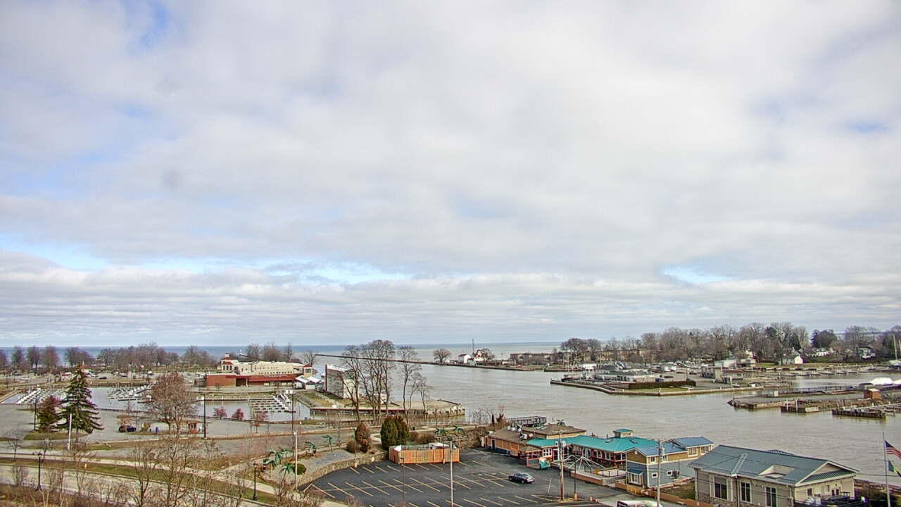
Sometimes during local weather reports, the reporter will stand in front of a livestream of the weather outside to share their report (like so: https://www.youtube.com/watch?v=2Yb_VA4L3YU). The cameras don’t move (and aren’t likely to do so), contain sizable portions of the sky, and are constantly running. After some light searching I even realized they’re shared online! I sent some cold emails to a few local stations and eventually got permission to use a weather camera pointed at Lake Ontario and the color filled sky above it. The camera feed was updated hourly and would be trivial to download from a publicly available web address on their site.
What is an average sky?
I wrote a python script to grab the top quarter of the image (the sky part) 5 minutes after the start of every hour (1:05a, 2:05a, …) with crontab. It saves it to a Google Cloud VM Instance (e2-micro) that was paid for with credits that I got from a hackathon a few years back. Google Cloud has a lot of tools and features, but it’s way more organized and intuitive than when I first tried using it in undergrad. There were some quirks but I get why it’s a heavily used service.
One question I came across was the difference between the average color and the dominant color. The former is a mean of pixel values (average of the red in each pixel, average of green in each pixel, average of blue in each pixel), while the latter is the color that is the most common and stands out in the image. I found the dominant image with K-means clustering (based on this SO answer) and saved that as an image was taken.
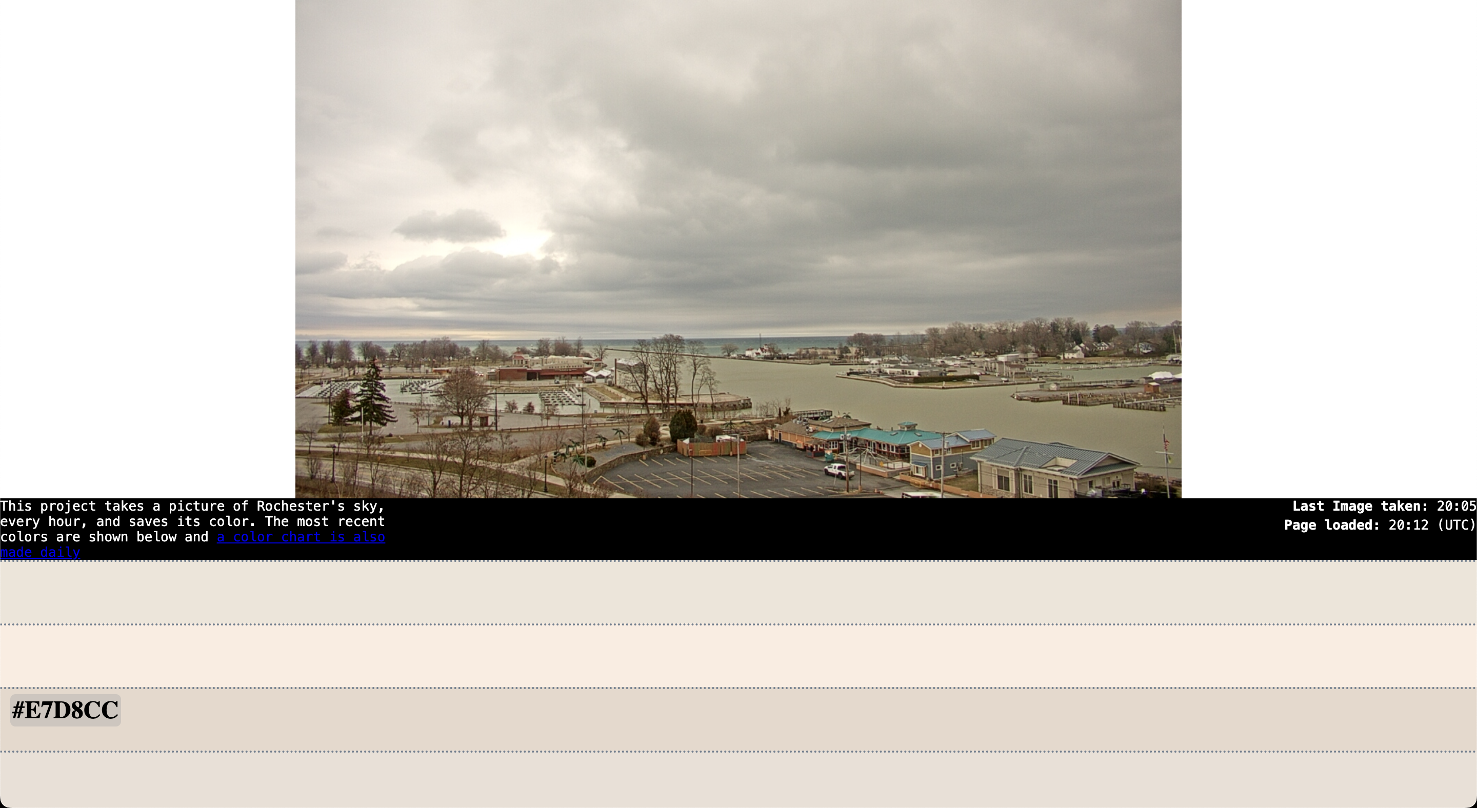
The site is a Flask template with the most recent photo from the lighthouse live stream at the top, the most recent colors of the sky (and their hex values) decending below, and a link to a chart of the sky’s colors (which is described in the next section).
How much does the sky change?
To address my initial question, I have the system plot a distribution of sky colors associated with the sun’s height when the photo was taken. In other words, it is a hour of the day in Rochester (ex. 2p = Hour 14) vs. height of the sun in the sky graph, where I plot the color of the sky at that time on the graph. I did this with PySolar, which has the funny subtitle of “staring directly at the sun since 2007”. After learning the difference between azimuth and altitude, and adding some jitter so I could see the different colors that could happen at each hour, I got a fun graph like this:
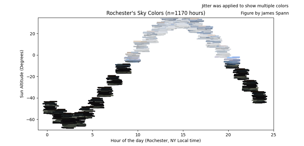
For now it is just a few data points from the past month (since I started recording image data on January 11th 2024) but over time I hope to get more detail on how the sky’s colors shift during the year and eventually make plots like this to compare monthly.
Thanks for reading and if you want to play around with the tool you can at my website rocsky.jspann.me .